
Causal Inference 2: Illustrating Interventions via a Toy Example
Last week I had the honor to lecture at the Machine Learning Summer School in Stellenbosch, South Africa. I chose to talk about Causal Inference, despite being a newcomer to this whole area. In fact, I chose it exactly because I'm a newcomer: causal inference has been a blindspot for me for a long time. I wanted to communicate some of the intuitions and ideas I learned and developed over the past few months, which I wish someone had explained to me earlier.
Now, I'm turning my presentation into a series of posts, starting with this one, building on the previous one I wrote in May. In this one, I will present the toy example I used in my talk to explain interventions. I call this the three scripts toy example. I was not sure if people are going to get it, but I got good feedback on it from the audience, so I'm hoping you will find it useful, too. Here are links to the other posts:
- Part 1: Intro to Causal Inference and do-Calculus
- ➡️️ Part 2: Illustrating Interventions with a Toy Example
- Part 3: Counterfactuals
- Part 4: Causal Diagrams, Markov Factorization, Structural Equation Models
Three scripts
Imagine you teach a programming course and you ask students to write a python script that samples from a 2D Gaussian distribution with a certain mean and covariance. Some of the solutions will be correct, but as there are multiple ways to sample from a Gaussian, you might see very different solutions. For example, here are three scripts that would implement the same, correct sampling behaviour:
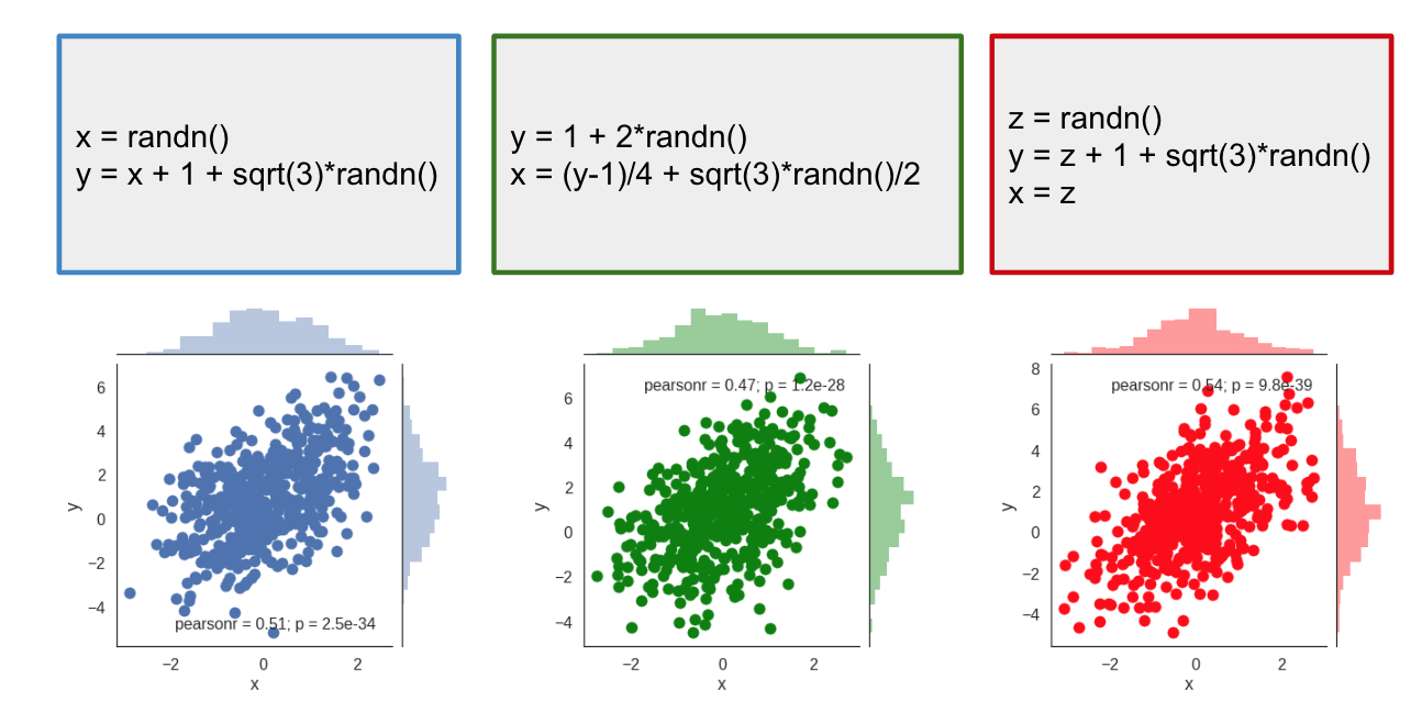
Below each of the code snippets I plotted samples drawn by repeatedly executing the scripts. As you can see, all three scripts produce the same joint distribution between $x$ and $y$. You can feed these distributions into a two-sample test, and you will find that they are indeed indistinguishable from each other.
Based on the joint distribution the three scripts are indistinguishable.
Interventions
But despite the three scripts being equivalent in that they generate the same distribution, they are not exactly the same. For example, they behave differently if we interefere or intervene to the execution.
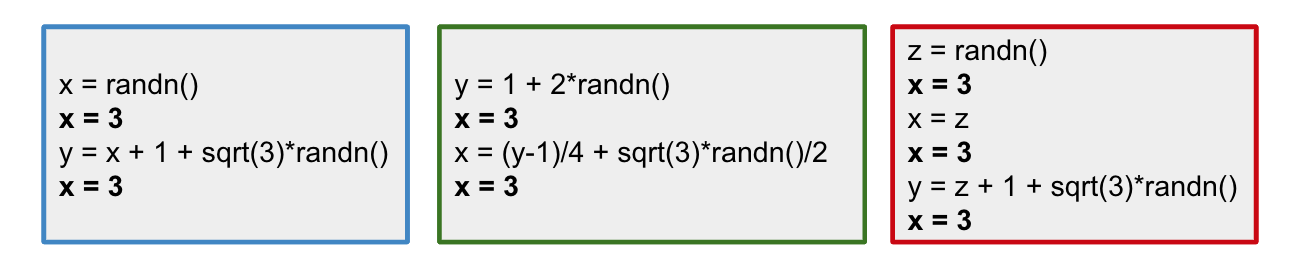
Consider this thought experiment: I am a hacker, and I can inject code to the python interpreter. For every line of code from the snippet, I can insert a line of code of my choice. Let's say that I really want to set the value of $x$ to $3$, so I use my code injection ability and insert the line x=3 after each line of code of yours. So what actually gets executed is this:
We can now run the scripts in this hacked interpreter and see how the intervention changes the distribution of $x$ and $y$:
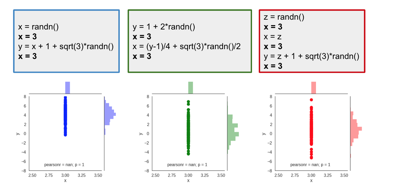
Of course, we see that the value of $x$ is no longer random, it's deterministically set to $3$, this results in all samples lining up along the $x=3$ vertical line. But, interestingly, the distribution of $y$ is different for the different scripts. In the blue script, $y$ has a mean around $5$ while the green and red scripts produce a distribution of $y$ centered around a mean of $1$. Here is a better look at the marginal distribution of $y$ under the intervention:
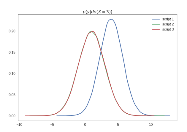
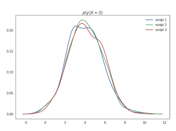
I labelled this plot $p(y\vert do(X=3))$ which semantically means the distribution of $y$ under the intervention where I set the value of $X$ to $3$. This is generally different from the conditional distribution $p(y\vert x=3)$, which of course is the same for all three scripts. Below I show these conditionals - excuse me for the massive estimation errors here, I was lazy creating these plots, but believe me they technically are all the same:
The important point here is that
the scripts behave differently under intervention.
We have a situation where the scripts are indistinguishable when you only look at the joint distribution of the samples they produce, yet they behave differently under intervention.
Consequently,
the joint distribution of data alone is insufficient to predict behaviour under interventions.
Causal Diagrams
If the joint distribution is insufficient, what level of description would allow us to make predictions about how the scripts behave under intervention. If I have the full source code, I can of course execute the modified scripts, i.e. run an experiment and directly observe how the interaction effects the distribution.
However, it turns out, you don't need the full source code. It is sufficient to know the causal diagram corresponding to the source code. The causal diagram encodes causal relationships between variables, with an arrow pointing from causes to effects. Here is what the causal diagrams would look like for these scripts:
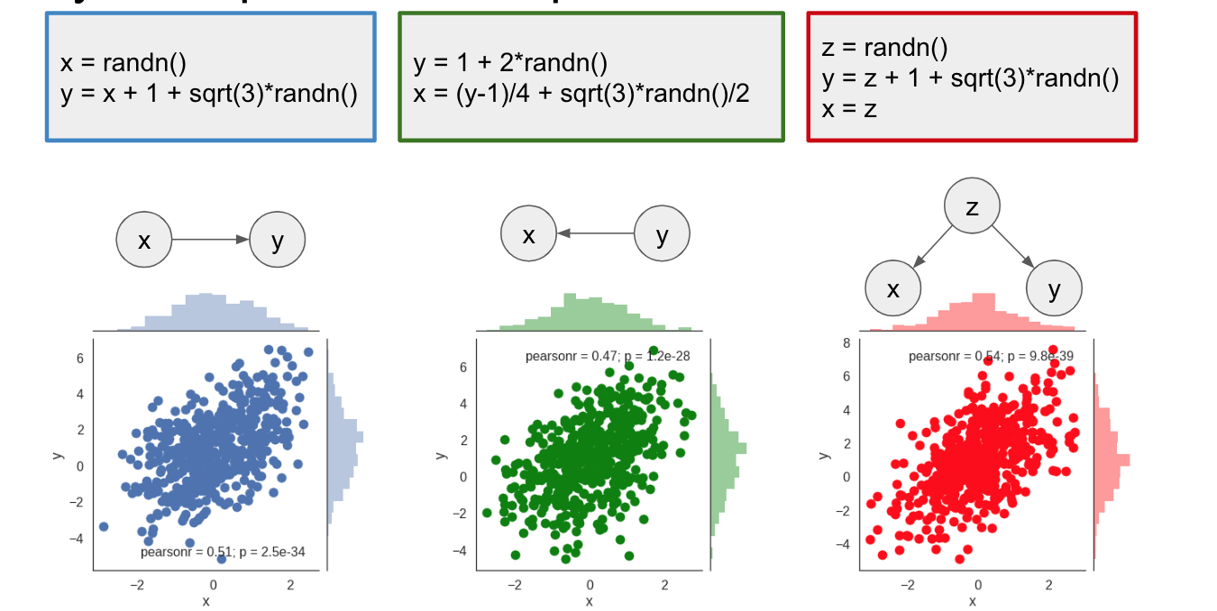
We can see that, even though they produce the same joint distribution, the scripts have different causal diagrams. And this additional knowledge of the causal structure allows us to make inferences about intervention without actually running experiments with that intervention. To do this in general setting, we can use do-calculus, explained in a little bit more detail in my earlier post.
Graphically, to simulate the effect of an intervention, you mutilate the graph by removing all edges that point into the variable on which the intervention is applied, in this case $x$.
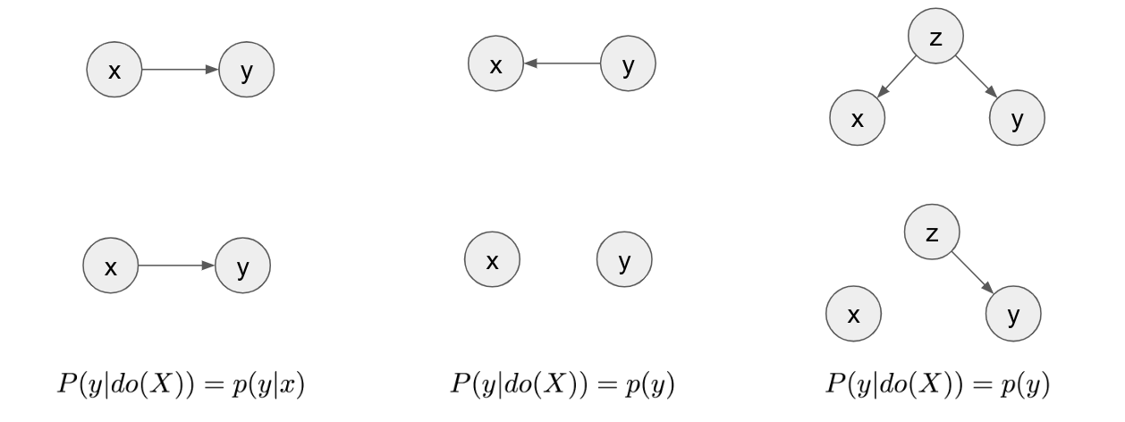
At the top row you see the three diagrams that describe the three scripts. In the second row are the mutilated graphs where all incoming edges to $x$ have been removed. In the first script, the graph looks the same after mutilation. From this, we can conclude that $p(y\vert do(x)) = p(y\vert x)$, i.e. that the distribution of $y$ under intervention $X=3$ is the same as the conditional distribution of $y$ conditioned on $X=3$. In the second script, after mutilation, $x$ and $y$ become disconnected, therefore independent. From this, we can conclude that $p(y\vert do(X=3)) = p(y)$. Changing the value of $x$ does nothing to change the value of $y$, so whatever you set $X$ to be, $y$ is just going to sample from its marginal distribution. The same argument holds for the third causal diagram.
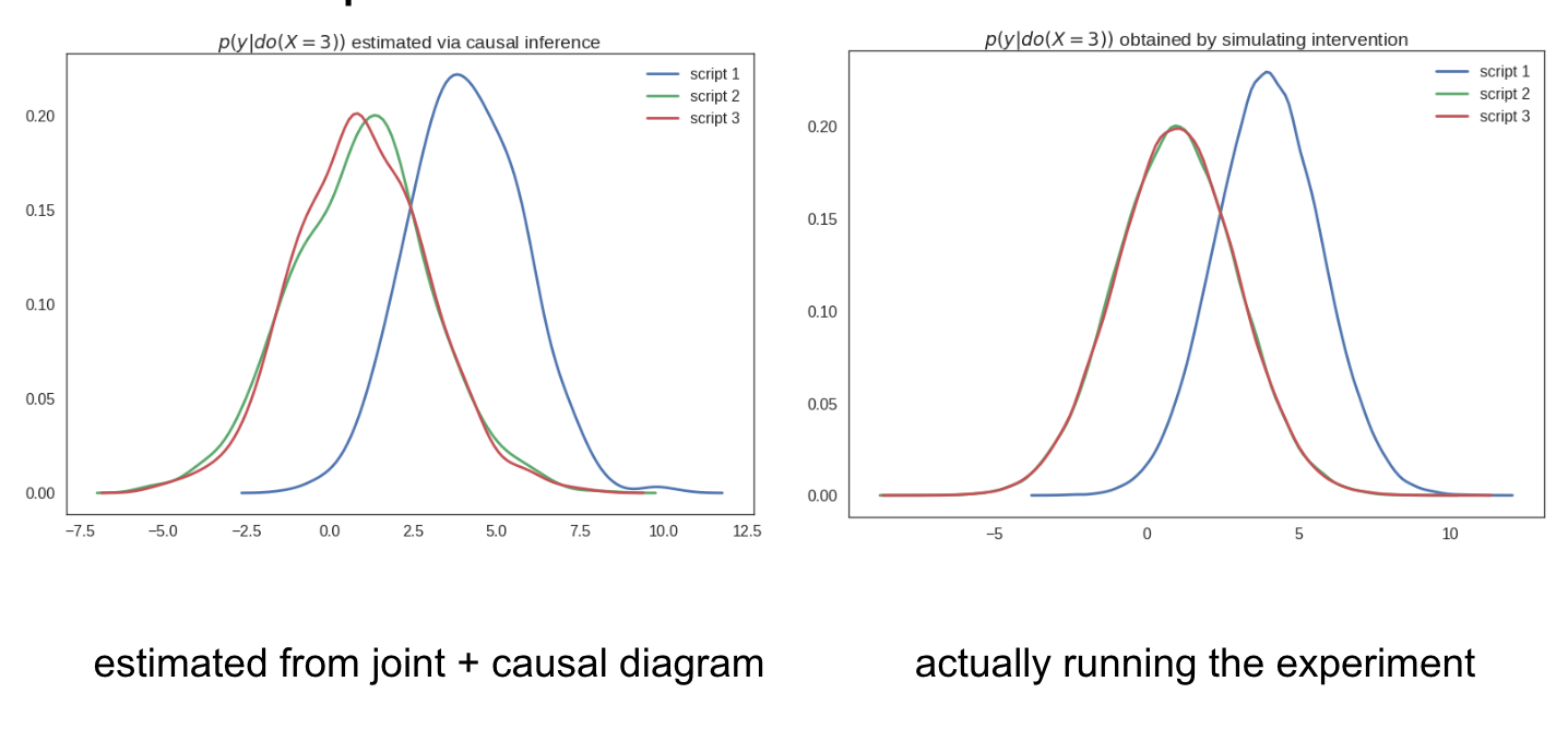
The significance of this is the following: By only looking at the causal diagram, we are now able to predict how the scripts are going to behave under the intervention $X=3$. We can compute and plot $p(y\vert do(X=3))$ for the three scripts by only using data observed during the normal (non-intervened) condition, without ever having to run the experiment or simulate the intervention.
The causal diagram allows us to predict how the models will behave under intervention, without carrying out the intervention
Here is proof of this, I could estimate the distribution of $y$ observed during the intervention experiment using only samples from the script under the normal (non-intervention) situation. This is called causal infernce from observational data.
The morale of the story
The morale of this story is summed up in the following picture:
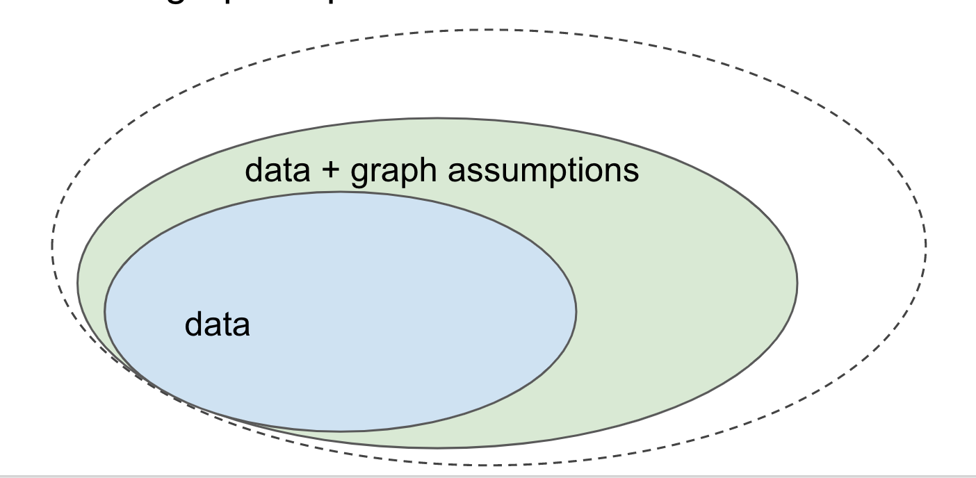
Let's consider all the questions you would want to be able to answer given some data (i.i.d. samples from a joint distribution). Having access to data, or more generally, the joint distribution it was sampled from, allows you to answer a great many questions, and solve many tasks. For example, you can do supervised machine learning by approximating $p(y \vert x)$ and then use it for many things, such as image labelling. These questions together make up the the blue set.
However, we have already seen that some questions cannot be answered using data/joint distribution alone. Notably, if you want to make predictions about how the system you study would behave under certain interventions or perturbations, you typically won't be able to make such infernces based on the data you have. These types of questions lie outside the blue set.
However, if you complement your data with causal assumptions encoded in a causal diagram - a directed acyclic graph where nodes are your variables - you can exploit these extra assumptions to start answering these questions, shown by the green area.
I am also showing an even larger set of questions still, but I won't tell you what this refers to just yet. I'm leaving that to a future post.
Where does the diagram come from?
The questions I got most frequently after the lecture were these: what if I don't know what the graph looks like? And what if I get the graph wrong? There are many ways to answer these questions.
To me, a rehabilitated Bayesian, the most appealing answer is that you have to accept that your analysis is conditional on the graph you choose, and your conclusions are valid under the assumptions encoded there. In a way, causal inference from observational data is subjective. When you publish a result, you should caveat it with "under these assumptions, this is true". Readers can then dispute and question your assumptions if they disagree.
As to how to obtain a graph, it varies by application. If you work with online systems such as a recommender system, the causal diagram is actually pretty simple to draw, as it corresponds to how various subsystems are hooked up and feed data to one another. In other applications, notably in healthcare, a little bit more guesswork and thought may involved.
Finally, you can use various causal discovery techniques to try to identify the causal diagram from the data itself. Theoretically, recovering the full causal graph from the data is impossible in general cases. However, if you add certain additional smoothness or independence assumptions to the mix, you may be able to recover the graph from the data with a certain reliability.
Summary
We have seen that modeling the joint distribution can only get you so far, and if you want to predict the effect of interventions, i.e. calculate $p(y\vert do(x))$-like quantities, you have to add a causal graph to your analysis.
An optimistic take on this is that, in the i.i.d. setting, drawing a causal diagram and using do-calculus (or something equivalent) can significantly broaden the set of problems you can tackle with machine learning.
The pessimist's take on this is that if you are not aware of all this, you might be trying to address questions in the green bit, without realizing that the data won't be able to give you an answer to such questions.
Whichever way you look at it, causal inference from observational data is an important topic to be aware of.